Theme Features

This theme is built on the Warp framework, a well-engineered theme framework for WordPress and Joomla, and utilizes all of its latest features. The user interface is powered by UIkit, a lightweight and modular front-end framework, which provides the theme's styling. The theme also comes with a wide range of different layouts and widget variations.

This theme is available for JoomlaJoomla and WordpressWordPress including the same features on each system.

Six beautiful styles

Theme styles

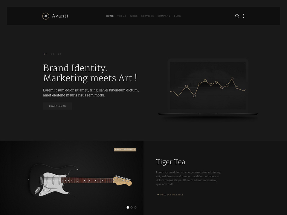
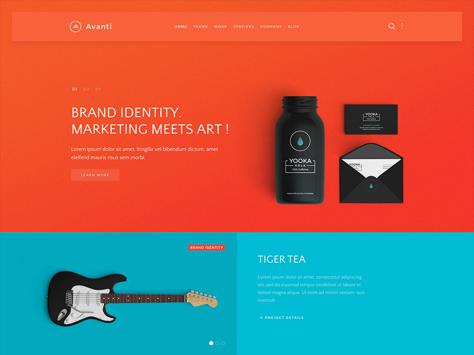
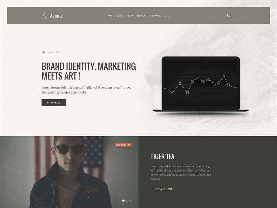
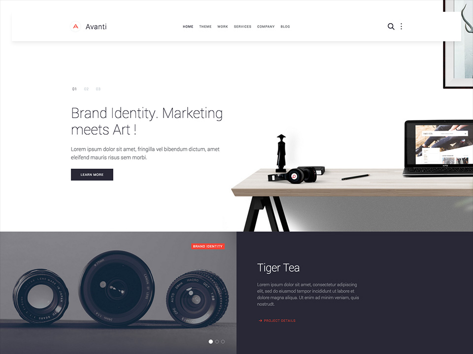
We provide lovingly crafted style variations to give you a glimpse of what is possible with this theme. The built-in theme customizer allows you to modify colors, fonts, sizes and much more without any CSS knowledge. Just choose your colors with the color picker and adjust the theme with only a few clicks. Click on one of the images to see the style.

Default

Default

Minimal

Minimal

Noble

Noble

Colorful

Colorful

Urban

Urban

Modern

Modern

Theme

Theme Features

Avanti is featuring brand new and advanced Warp options.
Navigation

Navigation

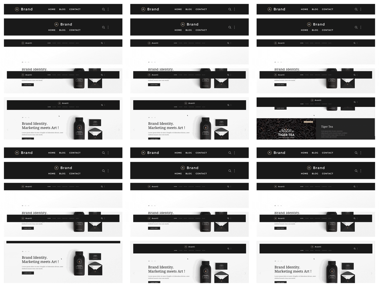
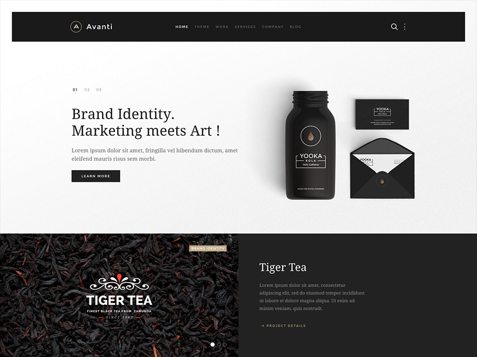
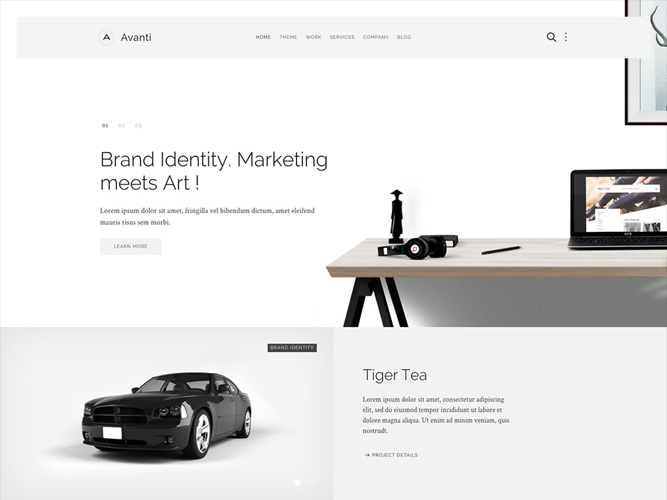
The main navigation of Avanti Theme supports the latest UIkit sticky navigation component features. You are able to select from 3 different navigation behaviors/styles and 2 layouts. The styles and the layouts can be combined. This makes 6 different navigation combinations.

Navigation Styles

  • Not Sticky – Default navigation.
  • Always Sticky – Floating sticky navigation with spacing around the navigation bar.
  • Sticky and Animated – This style floats over the content and sticks to the top of the browser window when you start scrolling down.

Navigation Layouts

  • Single Row – The default navbar with the logo on the left side and centered menu items. /layouts/header.default.php
  • Centered – Logo and menu items are centered and stacked. /layouts/header.centered.php

If you want to support a bigger logo size or if you want to modify the navbar gutter, please use the Customizer to change the values.

Special navbar positions

  • search – The search will be displayed inside a dropdown with automatic focus on the search field.
  • more – The same markup as the search, a dropdown which can be used for social icons for example.

If you want to change the dropdown width or color, please use the Customizer to change the values.

Footer

Footer

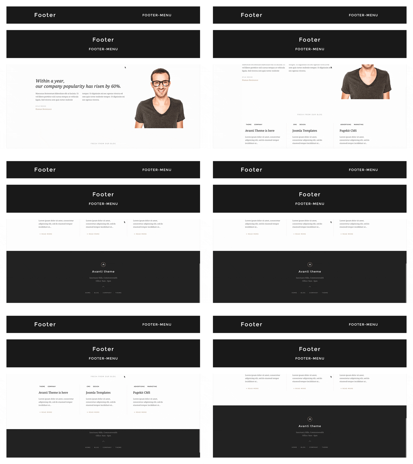
In this theme you can choose from 2 different footer layouts and combine them with the fixed footer option.

Footer Layouts

  • Single Row – The default footer with the footer module/widget on the left side and the footer-menu on the right. /layouts/footer.default.php
  • Centered – Footer module/widget is centered and the footer-menu is centered below. /layouts/footer.centered.php

Options

Footer Fixed: This fixes the footer block position and your website will scroll over the footer.
Enable Contrast: This option toggles the uk-contrast class from UIkit. It improves the appearance of elements when placing them on colored or dark backgrounds.

To modify the height of the footer and/or the fixed footer, please change the height values in the Customizer.

Block Appearance

Block Appearance

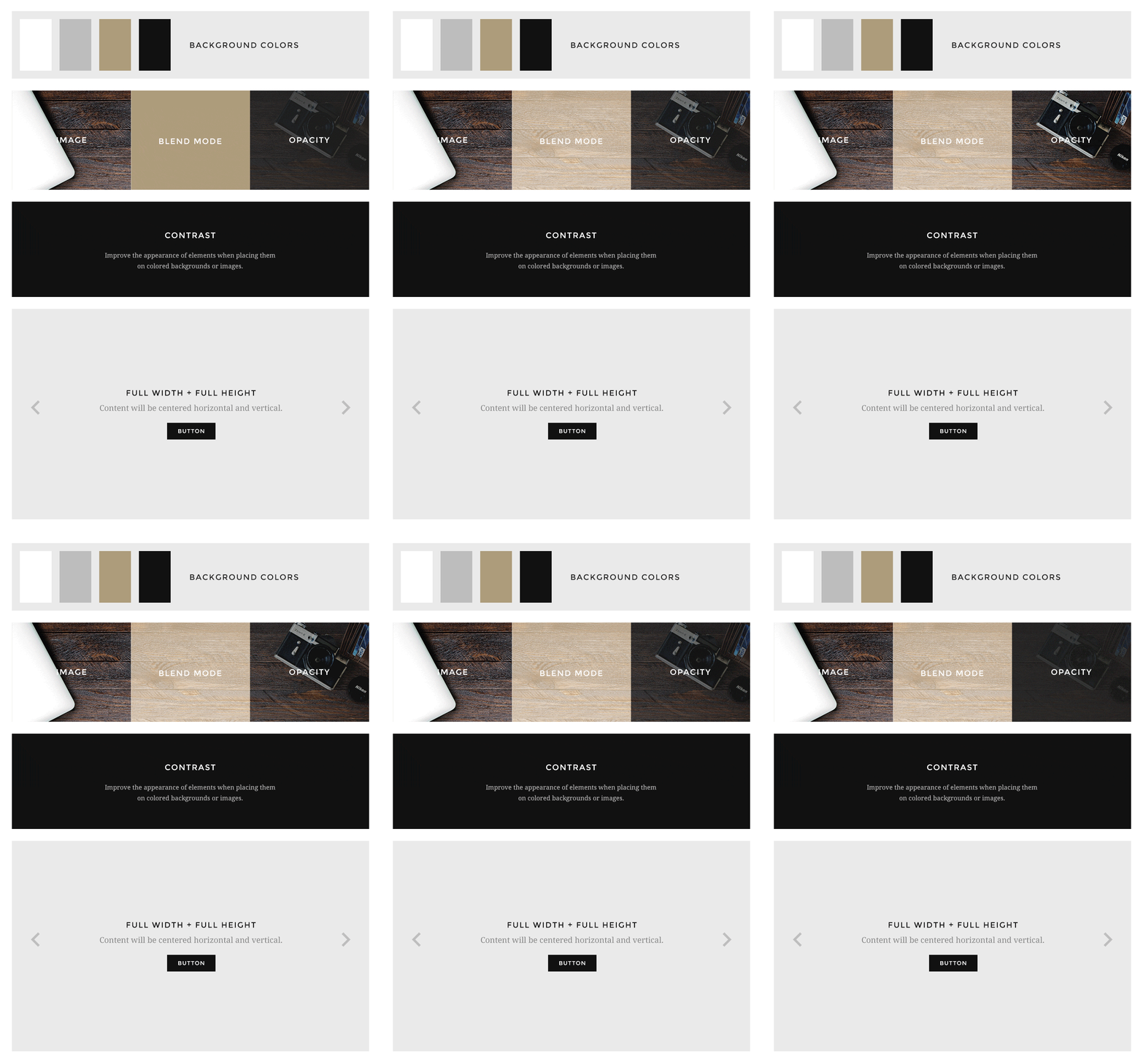
Avanti supports some useful options for all block layout positions. All settings can be combined for a block position. If you need different block settings for different pages, you can use layout profiles and assign them to your menu items.

Options

  • Background – Choose from 4 different background colors.
  • Image – Enter a path to a background image for this position.
  • Image Blend – Define how the background image will mix/blend with the background color.
  • Image Opacity – Adds an overlay with the same background color of the block and an opacity value.
  • Contrast – Enables the Contrast component. Recommended for block positions with a primary background color or image.
  • Padding – Select the spacing between the content and its block container.
  • Full Width – This removes the constraint of the content container so it will extend to full viewport width. Recommended for full width Widgetkit slideshows, for example.
  • Full Height – The block will take up full viewport height. If the navbar is set to default, the navbar height will automatically be subtracted from the subsequent block.
  • Grid Collapse – This option will reset the grid gutter and is recommended, if you want to use a full width Widgetkit slideshow or something similar.
  • Class – Use this input field for a custom CSS class which will be added to the block.

If you want to modify the background colors or paddings of the block elements, please use the Customizer and change the values.

Other Options

Other Options

Additionally you have more options to customize your theme layout.

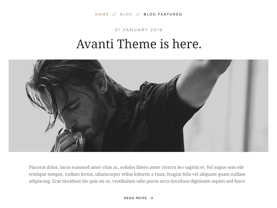
Article Style

Display blog articles in a special theme specific layout. /layouts/_post.php

Breadcrumb

This option centers the breadcrumbs and adds some more spacing to the following elements. Recommend for the theme specific article layout.
Custom widgets

Theme Widgets

Avanti comes with some exclusive widgets which slightly differ from regular Widgetkit widgets. We have added some custom markup and new features.

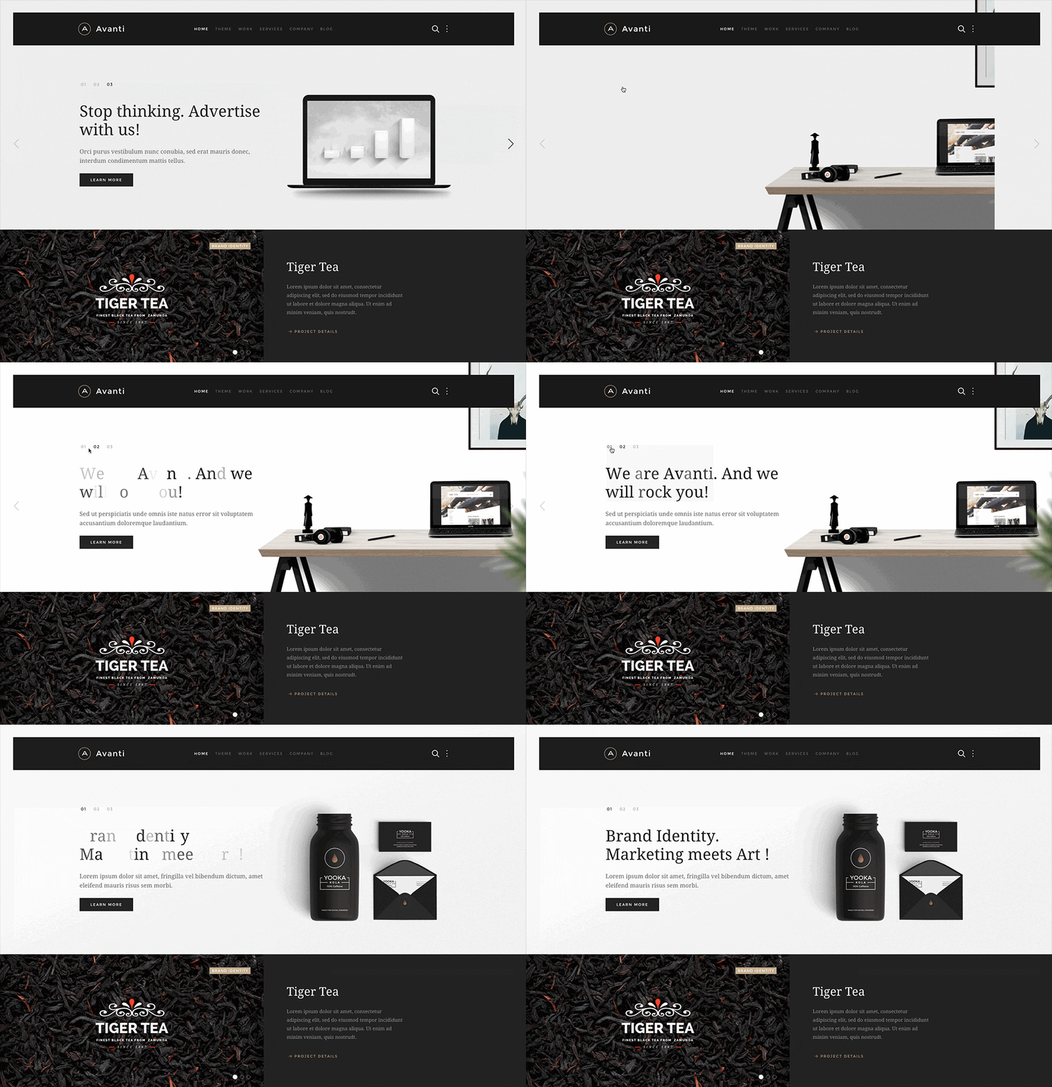
Slideshow Avanti

Slideshow Avanti

Avanti comes with a modified Slideshow widget which works perfectly inside the theme’s header layout position.

Specials

  • Pure CSS Numnav option to navigate between the slides.
  • The overlay layout uses the same container width as the theme.
  • Overlay content width for medium to large view ports can be set to 50%, 66%, 75% and 100% of the container.
  • Overlay content position can be set to Center, Center left and Center right.
  • Animate Letters option for the slideshow item title.

Slideshow Panel Avanti

Slideshow Panel Avanti

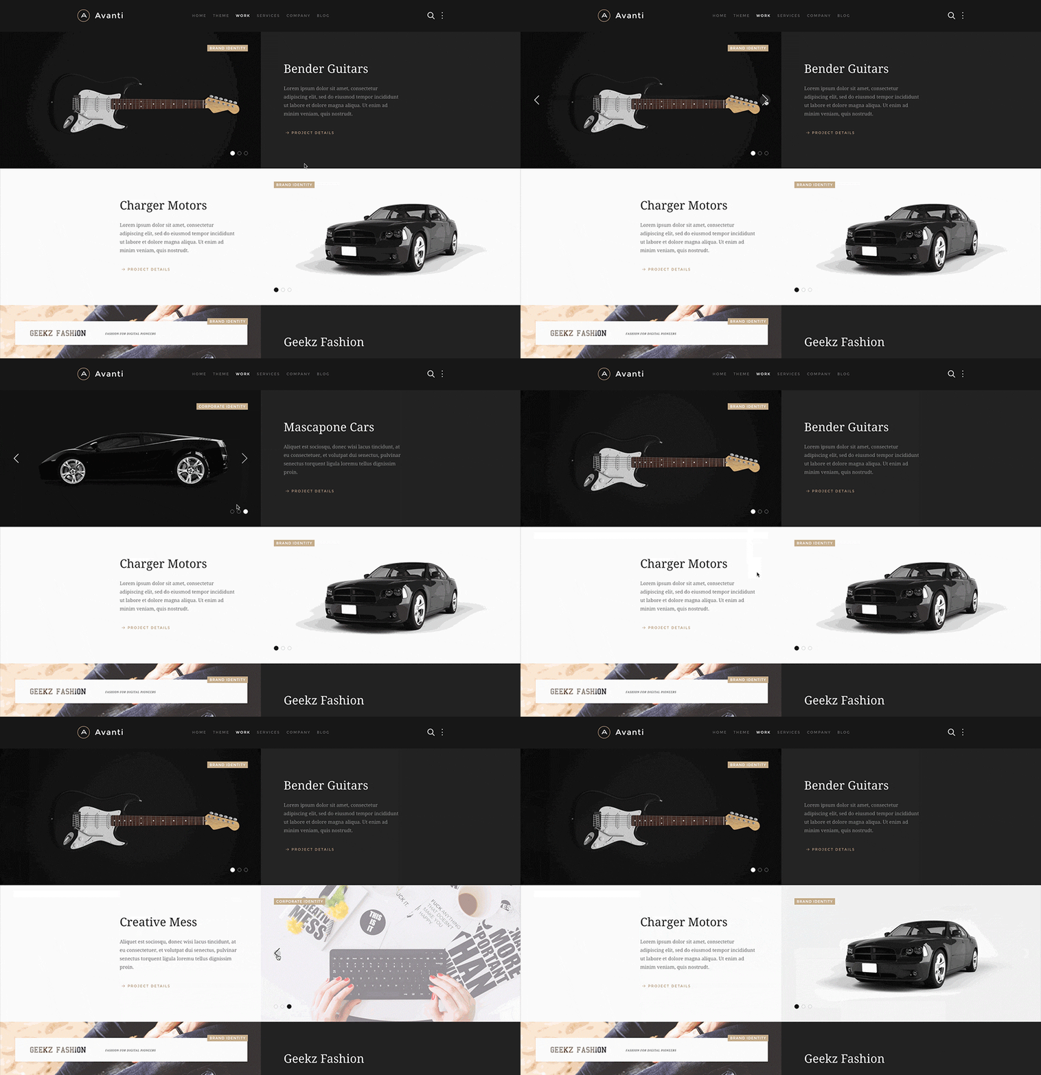
With the Widgetkit 2.5 release we have added the Slideshow Panel. Avanti uses a slightly modified version perfectly fitting for any portfolio, case study or product presentation.

Specials

  • Content max width – Will set a maximum width for the content on large view ports.
  • The badge is separated from the content and is displayed above the media item.

Grid Avanti

Grid Avanti

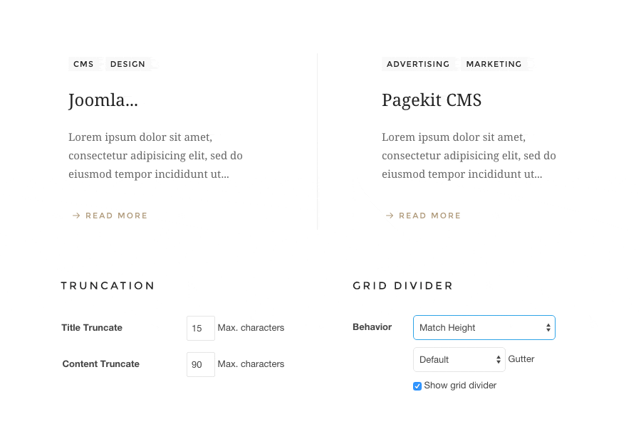
For Avanti we have added a modified grid widget to customize our output, especially the one we can not control at all, like WordPress/Joomla system content. We have added a truncate option for the title and the content which makes it easier to control the data output and height.

Specials

  • Truncation option for the item title and content.
  • Grid divider option displays a border between the items.
  • Panel Horizontal to add more spacing between items, recommend in combination with the grid divider.
  • Badge muted to display a badge with a subtle background color. (depends on the theme style)
  • Option to display article/post tags as badges.

CSS modifiers and additions

Theme Additions

Avanti has some helper classes and modifiers to slightly upgrade and control the content display. You can use them to to modify your content. Just remove them, if you prefer the regular UIKit rendering.

Widgetkit Gallery modifier

Widgetkit Gallery modifier

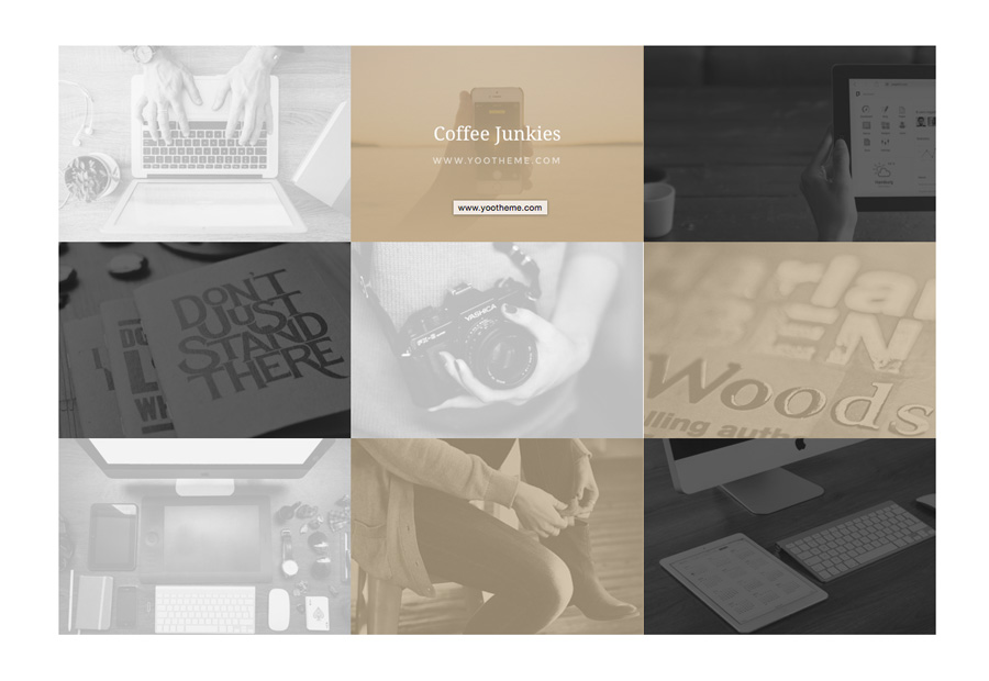
To give the gallery a chessboard like pattern we have added the .tm-gallery-avanti class. Just add the the class to the general HTML class field in your gallery widget. This class will work best for a 3 item per column setting.

This class also adds a special gradient overlay style to the gallery items. If you want to modify these gradients and backgrounds, please take a look at the theme variables in the Customizer.


Widgetkit Grid modifier

Widgetkit Grid modifier

We also added the .tm-margin-condensed class. It reduces the spacing between a widget title and the following content. Just add the class to a grid widget, for example in the HTML class field of the general tab in the widget administration.

Theme Icons

We have added a custom webfont which contains some usefull icons which we also used in our Avanti UIkit theme.

How to use

The theme icons are similiar to UIkit icon component. To apply this component, add any .uk-theme-icon-* class to an <i> or <span> element. Et voilà, you have a vector icon, which inherits size and color just like your text does.

  • slider-left
  • slider-right
  • slider-top
  • more
  • search
  • author
  • comment
  • tag
  • arrow-left
  • arrow-right
  • arrow-up
  • arrow-down
  • plus
  • minus
  • check
  • cross
  • menu

Featured Technologies

UIkit Framework

UIkit Framework

A lightweight and modular front-end framework for developing fast and powerful web interfaces.

Read more

Warp Framework

Warp Framework

A fast and slick theme framework which is built on the latest web techniques.

Read more